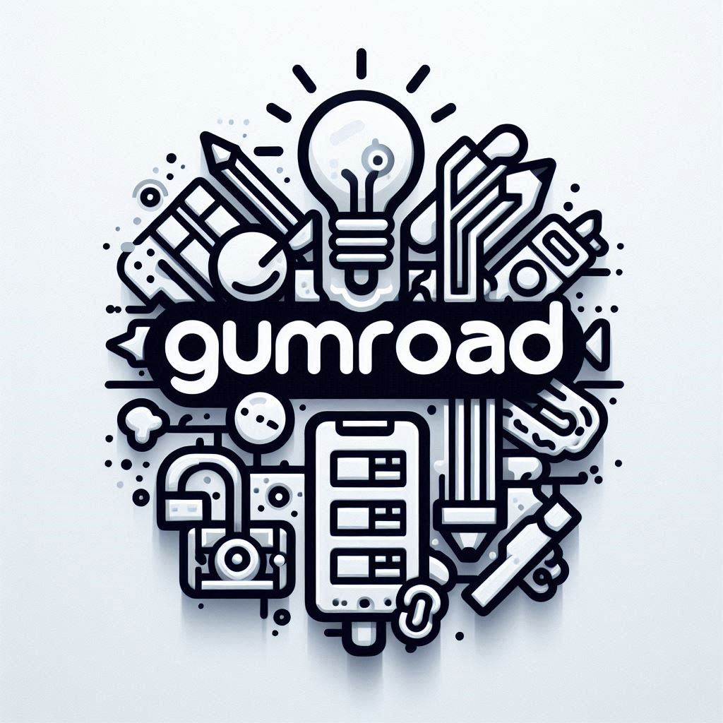
Are you ready to make your digital products stand out on Gumroad? It all starts with a great icon. The icon is the first visual element potential buyers see when browsing Gumroad. A strong, memorable icon can be the difference between a scroll and a click. This comprehensive guide will equip you with the knowledge and inspiration to create an impactful Gumroad icon that boosts your sales.
Table of Contents
- The Power of a Great Gumroad Icon
- Icon Design Inspiration and Trends
- Creating Your Gumroad Icon – Step by Step
- Tips for Optimizing Your Gumroad Icon
- FAQ
- Conclusion
The Power of a Great Gumroad Icon
Think of your Gumroad icon as the face of your product. It’s the visual representation of the time and effort you’ve invested in creating something valuable. In a marketplace filled with digital products vying for attention, a well-designed icon can make all the difference.
Why Your Gumroad Icon Matters
- First Impression: Your icon is the first thing potential buyers see. It needs to capture attention and create a positive first impression.
- Brand Identity: A unique and memorable icon becomes a part of your brand identity. It helps users recognize your products instantly.
- Visual Communication: The icon should communicate your product’s purpose and value in a clear, concise way.
- Increased Click-Through Rates: An appealing icon entices users to click on your product listing, leading to more views and potential sales.
Characteristics of a Successful Gumroad Icon
- Clear and Concise: Your icon should be instantly recognizable, even at a small size. Avoid using too much detail that might make it cluttered or difficult to understand.
- Relevance: The icon should accurately represent the product it’s for. Don’t mislead buyers with a visually appealing icon that has nothing to do with the product’s content.
- Visual Appeal: Use color palettes, fonts, and design elements that are visually appealing and create a sense of quality.
- Unique and Memorable: Strive to create a Gumroad icon that stands out from the competition. Research similar products and see how you can differentiate yours with a unique visual style.
Icon Design Inspiration and Trends
Before jumping into the design process, it’s crucial to gather inspiration and understand popular icon styles. This research will help you make informed decisions and choose a visual direction that aligns with your product and audience.
Exploring Popular Icon Styles
- Flat Design: Characterized by simple shapes, bold colors, and minimal details. Flat design creates a clean and modern look.
- 3D Icons: 3D icons add depth and realism. This style is great for products that need to convey a sense of sophistication or tangibility. Imagine a set of financial icons: a credit card rendered with subtle reflections, a stack of coins with realistic metallic sheen, and a money bag with a slightly organic texture—all crafted in 3D. These details grab attention and hint at the quality of your product.
- Line Art/Minimalist: Line art icons use simple lines and shapes to create a sleek and elegant look. This style is perfect for products that focus on simplicity and functionality.
- Illustrative/Hand-drawn: Hand-drawn icons bring a unique, personal touch. They’re ideal for products that need a more creative or whimsical feel.
Gumroad Icon Examples
Take a look at these outstanding Gumroad icons:
- Example 1: [Embed an image of a minimalist icon, perhaps one representing a writing guide]. This icon, with its simple linework and symbolic representation of a pen and paper, clearly hints at the product’s content while maintaining a clean, professional aesthetic.
- Example 2: [Embed an image of a colorful, flat design icon, maybe for a music sample pack]. This icon uses vibrant colors and simplified shapes to represent soundwaves, immediately conveying the product’s focus on audio content.
- Example 3: [Embed an image of a 3D icon, perhaps for a software plugin]. The 3D rendering, combined with carefully chosen lighting, makes this icon feel tangible and high-quality, a reflection of the product itself.
Drawing Inspiration from Other Sources:
Beyond Gumroad, there’s a vast world of icon design inspiration to explore. Here are a few resources to help you get started:
- Design Portfolios: Explore online design communities like Dribbble and Behance, where designers showcase their work. You’ll find a wide range of icon styles and approaches.
- Mobile App Icons: Pay attention to the icons of your favorite mobile apps. Analyze what makes them visually appealing and easily recognizable.
- Design Blogs and Websites: Follow design blogs and websites that specialize in icon design to stay up-to-date with the latest trends and techniques.
Creating Your Gumroad Icon – Step by Step
Now that you have a solid understanding of Gumroad icon best practices and have gathered some inspiration, let’s break down the design process step-by-step.
Step 1: Define Your Product and Target Audience
Before designing your icon, ask yourself these key questions:
- What are you selling? Clearly define your product’s purpose, features, and value proposition.
- Who is your ideal customer? Consider your target audience’s demographics, interests, and visual preferences.
- What visual style will resonate with them? Determine what type of icon style will appeal to your specific audience. For example, a flat design icon might be suitable for a tech product aimed at a young, tech-savvy audience. A more illustrative icon might be a better choice for a creative product targeted towards artists and designers.
Step 2: Gather Reference Images and Inspiration
Once you’ve defined your product and audience, it’s time to gather visual references and inspiration.
- Compile Icon Examples: Browse through design portfolios, mobile app stores, and icon design websites. Collect examples of icons that you find visually appealing, memorable, and relevant to your product.
- Focus on Similar Products: Pay particular attention to the icons of products similar to yours. Analyze their style, color palette, and symbolism. This will help you understand what works visually within your niche and how to differentiate your icon.
Step 3: Choose Your Icon Design Software
There are numerous software options available for icon design, ranging from free online tools to professional-grade software.
Free Options:
- Vectr: A web-based vector graphic editor that’s easy to learn and use. It’s a great choice for beginners.
- Canva: While primarily known for social media templates, Canva also provides tools for creating icons, including pre-made templates you can customize.
Paid Options:
- Adobe Illustrator: The industry-standard for vector graphic design. It provides powerful tools for creating precise, scalable icons.
- Affinity Designer: A more affordable alternative to Illustrator that still offers a robust set of design tools.
3D Design:
- Blender: A free and open-source 3D modeling software. It allows you to create realistic 3D icons, as demonstrated in the audio about creating a set of financial icons.
Step 4: Sketch Your Ideas
Before diving into digital design, it’s helpful to sketch out your ideas. This will allow you to experiment with different concepts and layouts quickly.
- Brainstorm Concepts: Start by sketching several rough ideas. Focus on different ways to visually represent your product and its unique features.
- Refine Your Ideas: Choose a few concepts that resonate with you and refine them. Focus on elements like composition, balance, and overall impact.
- Consider Feedback: If possible, share your sketches with peers or potential customers to gather feedback on which concepts are most appealing and effective.
Step 5: Design Your Icon
With your refined sketches as a guide, it’s time to create your Gumroad icon using the design software you chose.
- Start with Basic Shapes: Begin by creating the basic shapes that form the foundation of your icon. Keep your design simple and clean to ensure clarity at smaller sizes.
- Add Details and Textures: Gradually add details and textures to enhance your icon’s visual appeal. Be mindful not to overcrowd the design, as simplicity often translates better in smaller icons.
- Choose Colors Wisely: Select a color palette that aligns with your brand and appeals to your target audience. Consider color psychology and how different hues may affect perception.
- Incorporate Typography (if necessary): If your icon includes text, ensure it is legible and complements the overall design. Avoid using too many fonts, as this can make the icon look cluttered.
Step 6: Test Your Icon
Once your icon design is complete, it’s crucial to test how it looks across different devices and sizes.
- Resize Your Icon: Test your icon at various sizes to ensure it remains recognizable and visually appealing when scaled down.
- Check on Multiple Devices: View your icon on different devices and platforms to ensure consistency and clarity.
- Seek Feedback Again: Share your final design with others for additional feedback. Make any necessary adjustments based on the insights you receive.
Tips for Optimizing Your Gumroad Icon
To maximize the impact of your Gumroad icon, consider these additional tips:
- Consistency Across Products: If you have multiple products on Gumroad, aim for consistency in icon design. This helps establish a cohesive brand identity and makes your products easily recognizable.
- Optimize for Searchability: Use relevant keywords in your product title and description to improve searchability within Gumroad and external search engines. A well-optimized icon paired with effective SEO can enhance your product’s visibility.
- A/B Testing: Consider conducting A/B tests with different icon variations to determine which one resonates best with your audience. This can provide valuable insights into user preferences and behavior.
- Stay Updated on Trends: Design trends evolve over time. Stay informed about the latest trends in icon design to keep your product visuals fresh and relevant.
FAQ
1. How important is the icon size?
The icon size is crucial because it affects how well the design translates across different platforms. Make sure your icon is scalable and maintains clarity at smaller sizes commonly used on Gumroad.
2. Can I update my Gumroad icon after it’s been published?
Yes, you can update your Gumroad icon at any time. If you feel a redesign could improve click-through rates or better represent your product, don’t hesitate to make changes.
3. What if I’m not a skilled designer?
You don’t need to be a professional designer to create a great icon. Use simple design tools like Canva or hire a freelance designer from platforms like Fiverr or Upwork to assist with your icon creation.
4. Should my icon include text?
Including text in your icon can be beneficial for clarity, but it’s not necessary. If you choose to include text, ensure it’s legible and doesn’t overwhelm the design. Use text sparingly and prioritize the visual elements that represent your product.
5. How can I ensure my icon aligns with my brand identity?
Your icon should reflect your brand’s values and aesthetics. Use consistent colors, fonts, and design elements that align with your overall branding strategy.
Conclusion
Creating a compelling Gumroad icon is a powerful way to enhance your digital product’s appeal and boost sales. By focusing on clear, concise design that reflects your brand identity and resonates with your target audience, you can set your products apart in a crowded marketplace.
Remember, a great icon is more than just a visual element; it’s an essential part of your marketing strategy that can influence buyers’ perceptions and decisions. Take the time to design an icon that captures attention, communicates value, and leaves a lasting impression on potential customers.
By following this guide and staying informed about design trends, you’ll be well-equipped to create an impactful Gumroad icon that elevates your product’s success.