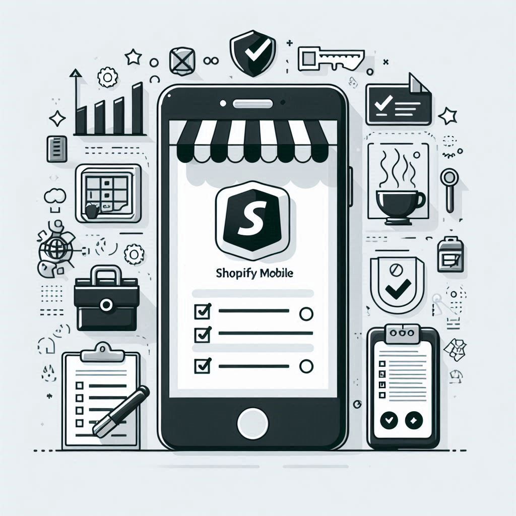
Table of Contents
- Introduction
- Shopify Mobile Optimization Checklist
- Testing and Monitoring
- FAQ Section
- Conclusion
Introduction
In 2025, mobile optimization is no longer a “nice-to-have” for ecommerce businesses—it’s essential. More people than ever are browsing and shopping on their smartphones. Your Shopify store needs to be ready to meet them there. Google’s mobile-first indexing prioritizes mobile-friendly websites in search results, making shopify mobile optimization crucial for visibility.
Optimizing your Shopify store for mobile has numerous benefits, including:
- Higher Conversion Rates: A smooth and user-friendly mobile experience encourages shoppers to complete purchases.
- Increased Customer Engagement: Engaging mobile features like push notifications and shopify mobile apps keep customers connected to your brand.
- Improved Brand Perception: A well-optimized mobile store signals professionalism and trustworthiness, enhancing your brand image.
Shopify Mobile Optimization Checklist:
To ensure your Shopify store is fully optimized for the mobile experience, use this comprehensive checklist:
Website Performance:
Page Speed Optimization:
- The need for speed: Slow-loading pages are a major turnoff for mobile users who expect instant gratification. Studies have shown a direct correlation between page speed and bounce rate, meaning every second counts.
- Measure your performance: Utilize tools like Google PageSpeed Insights and GTmetrix to analyze your shopify mobile site’s loading speed and identify areas for improvement.
- Tips to accelerate your site:
- Optimize Images: Compress images to reduce file size without compromising quality. Use appropriate formats like WebP for better compression and quality.
- Minimize Code: Remove unnecessary code from your HTML, CSS, and JavaScript files to reduce load times.
- Utilize a CDN: A content delivery network (CDN) distributes your store’s content across multiple servers worldwide, reducing the distance data needs to travel and improving load times for users in different locations.
- Implement Lazy Loading: Delay the loading of images and videos until they are needed. This allows the critical content to load first, providing a faster initial experience for the user.
Responsive Design:
- Universal appeal: Your Shopify store should adapt seamlessly to any screen size, whether it’s a large desktop monitor or a small smartphone. This is particularly important for shopify iphone users, as they represent a significant portion of mobile shoppers.
- Choosing the right theme: Select a responsive theme from the Shopify Theme Store that automatically adjusts layout and content based on the user’s device. Look for shopify mobile friendly themes for optimal viewing on smartphones. This differs from having a separate mobile-specific theme, which can be more challenging to manage.
- Test on various devices: Regularly test your store’s responsiveness on different devices and screen sizes. Use emulators and simulators to cover a wider range of options.
User Interface and Navigation:
Touch-Friendly Design:
- Fingertip-first design: Mobile interactions are primarily touch-based, so design elements need to accommodate larger fingertip targets.
- Button Optimization: Ensure buttons are large enough to be easily tapped and have adequate spacing between them to prevent accidental clicks.
- Clear CTAs: Use clear and concise calls to action (CTAs) that guide users towards desired actions.
- Intuitive Gestures: Integrate common mobile gestures like swiping and tapping for a more intuitive user experience.
Streamlined Navigation:
- Mobile-first navigation: Simplify your store’s navigation for mobile users. Complex menus with multiple levels can be frustrating to navigate on a small screen.
- Prioritize essential menus: Keep your top-level menu concise with only the most important categories. Use submenus sparingly and make them easily accessible.
- Search is key: Implement a prominent search bar to help users quickly find the products they are looking for.
- Sticky menus: Use sticky menus that remain visible at the top of the screen as the user scrolls, allowing for persistent navigation throughout the store.
Product Presentation:
High-Quality Product Images:
- Visual storytelling: High-quality product images are paramount for capturing attention and showcasing your products effectively on mobile devices. Invest in professional photography for the best results.
- Image optimization: Compress images to improve page speed but avoid excessive compression that degrades image quality. Use high-resolution images and allow for zooming to view product details.
Compelling Product Descriptions:
- Concise & informative: Write product descriptions specifically for mobile consumption. Keep them concise and easy to read on smaller screens.
- Format for readability: Utilize bullet points, headings, and short paragraphs to break up text and improve readability.
- Focus on benefits: Highlight key product features and benefits that resonate with mobile shoppers.
Checkout Process:
Mobile-Optimized Checkout:
- Frictionless experience: Simplify the checkout process as much as possible. A smooth and effortless checkout flow encourages completion and reduces cart abandonment rates.
- Minimize form fields: Only ask for essential information during checkout and utilize autofill to streamline data entry.
- Guest checkout: Offer a guest checkout option for users who prefer not to create an account.
- Mobile wallets: Integrate mobile wallets like Apple Pay and Google Pay to allow for faster and more secure payments.
Marketing and Engagement:
Push Notifications:
- Direct engagement: Utilize push notifications to send timely updates, promotions, and personalized messages directly to customers’ mobile devices. This is a major benefit of having a shopify mobile app for customers.
- Targeted messaging: Segment your audience based on demographics, purchase history, and browsing behavior to deliver more relevant and effective push notifications.
- Avoid overuse: Be mindful of notification frequency. Bombarding users with too many notifications can lead to annoyance and opt-outs.
Mobile App Integration:
- Enhanced customer experience: Creating a dedicated shopify mobile app for store can further enhance customer engagement and provide a more personalized shopping experience. For those looking to take mobile optimization to the next level, a dedicated mobile app offers many benefits for reaching and engaging customers.
- Popular app builders: Several reputable shopify mobile app builders can help you bring your vision to life, such as:
- Shopney Mobile App Builder
- OneMobile
- Appstle Mobile App Builder
- Vardot Mobile App Builder
- Evlop Mobile App Builder
- Essential features: When selecting a best shopify mobile app builder, consider shopify mobile app pricing and prioritize features like:
- Push Notifications: Engage customers with targeted promotions, updates, and reminders.
- Instant Syncing: Ensure your app’s product catalog, inventory, and pricing are automatically synced with your Shopify store.
- Customizable Design: Create an app that reflects your brand identity and provides a unique customer experience.
- In-app Chat: Offer real-time support and personalized assistance to app users.
- Integrations: Choose a builder that integrates seamlessly with other apps you use for marketing, analytics, and customer support. You’ll want a builder that allows for easy shopify mobile app integration with your existing tools.
Testing and Monitoring:
Regular Mobile Testing:
- Ongoing testing is crucial: Regularly test your store on different mobile devices and operating systems. Cover a range of screen sizes, resolutions, and browsers.
- A/B testing: Use A/B testing to compare different variations of your mobile store design and features. This data-driven approach helps optimize for conversions.
- User feedback: Encourage users to provide feedback about their mobile experience. This can reveal valuable insights and areas for improvement.
Analytics and Tracking:
- Measure mobile performance: Use Google Analytics to track key mobile metrics, including bounce rate, time on site, conversion rate, and page views.
- Analyze user behavior: Understand how users are interacting with your store on mobile. Identify popular product categories, navigation paths, and potential points of friction.
- Data-driven decisions: Use the insights gathered from analytics to inform your mobile optimization strategy and make data-driven decisions to improve performance.
FAQ Section:
What is a mobile-first approach to web design?
A mobile-first approach prioritizes designing for the smallest screen (smartphones) first, and then scaling up to larger screens (tablets and desktops). This ensures a user-friendly experience on all devices and aligns with Google’s mobile-first indexing.
Do I need a separate mobile app for my Shopify store?
Not necessarily. A well-optimized mobile website can be sufficient for many businesses. However, a mobile app can offer deeper engagement features, push notifications, and a more branded experience. Consider your target audience, budget, and desired level of customer engagement when making this decision.
Which Shopify mobile app builder is right for me?
The best app builder depends on your specific needs and budget. Consider factors like:
- Pricing: Some builders offer free plans with limited features, while others have paid plans with more customization options.
- Features: Essential features include push notifications, instant syncing, customizable design, in-app chat, and integrations with other apps.
- Ease of use: Look for a builder with a user-friendly interface and drag-and-drop functionality.
- Reviews: Read reviews from other Shopify merchants to get an idea of each builder’s strengths and weaknesses.
How often should I test my store on mobile devices?
Test your store regularly, especially after making any design or code changes. Aim for at least monthly testing on various devices and browsers to ensure optimal performance and identify any potential issues.
What are the most important metrics to track for mobile optimization?
Key metrics include:
- Bounce Rate: The percentage of visitors who leave your site after viewing only one page. A high bounce rate indicates potential issues with mobile usability or page content.
- Conversion Rate: The percentage of visitors who complete a desired action, such as making a purchase. A low conversion rate on mobile suggests areas for improvement in the checkout process or overall user experience.
- Time on Site: The average time visitors spend on your store. Short dwell times may signal a lack of engagement or difficulty finding information.
- Page Views: The number of pages viewed per visit. This metric helps you understand how users navigate your store on mobile.
Conclusion:
Mobile optimization is an ongoing process that requires continuous attention and adaptation. By following this checklist and staying informed about emerging mobile trends, you can ensure your Shopify store is well-positioned to attract, engage, and convert mobile shoppers in 2025 and beyond.